Icons are more like a graphic image or symbol used to represent or denote a subject, project, app or even a website.
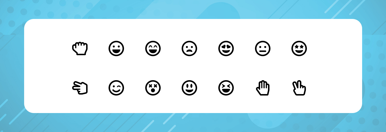
To understand it further, Let me share a simple e.g. here with you. We all happen to chat with friends, colleagues etc.., and when we wish to express a feeling of happiness, we use a smiling smiley, isn't it? Believe it or not, this will, in turn, bring a smile onto the face of the person at the other end. That is the impact of the smiley, it did convey a message of happiness that will be remembered by the person who you chatted with. Icons work more or less in the same way for personnel as well as professional use.
When it comes to user experience, let us imagine a user visiting a web page with just mundane writing, without any icons or images or graphics in it. It will only take seconds for the user to close it down or browse away from the page, because honestly, no one wishes to take time, read and understand a subject with an extra effort, instead everyone prefers to get a message understood clearly with ease and simplicity.
Below mentioned are a few pointers on how icon usage can enhance the user experience when used in web-pages, apps and projects.
Users don’t prefer to stay on a page that looks cluttered and crowded.
Users love to visit a web page that is user friendly, (icons can help you get that look).
Unlike long sentences, icons take in very less space on a web page
Having a colourful and cheerful icon will bring a positive vibe to the page
Its easier to draw the attention of users with visual images than write-ups
Icons work more or less like a gift wrap to the web page
With uncluttered page, the user is left with easy navigation and browsing experience
These play a vital role in enhancing your brand's identity
It becomes simpler to read and understand your brand with the help of the right icons
Navigation becomes hassle-free
We can say that icons can be used not only to convey a message but also to simplify the message.
This is exactly what we require when we are trying to explain or submit a project to the team or team head because simplified messages or pointers via icons are way much easier to understand than mundane long sentences.
According to a recent study, it has been learnt that human minds are capable to take in the message that is defined or presented with images for a longer period, than messages conveyed with mere words. One more reason to use icons, I must say. Because this helps the message stay in the minds of a user for a longer period. what better way to think of to pass a message, other than with an icon.
When the icons are used effectively, the project will look out of the box.
Visual images will make the project look more colourful.
When long sentences are replaced with icons, it will save the project from looking boring.
When icons are used in the right way, it will create an interaction cue with the project.
The animation will make the project more fun and lively.
When they are clubbed together, the icons will give away creativity to your project
A modern aesthetic can be created by doing a mix and match of the icons.
Adding a few sketches will give it an identity of its own.
A project will be of perfection when you add good iconography to it because this will, in turn, increase the polish and finesse of the same. The project will also look interesting and give away a good vibe.